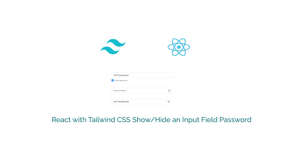
In this tutorial, we will create a show/hide password input field in React.js using Tailwind CSS. We’ll explore toggling the visibility of the password field with an eye icon, as well as using a checkbox to show and hide the password. These examples will demonstrate how to implement this functionality using Tailwind CSS and React.
Tool Use
React JS
Tailwind CSS 3.v
Heroicons Icon
First you need to setup react project with tailwind css. You can install manually or you read below blog.
How to install Tailwind CSS in React
Install & Setup Vite + React + Typescript + Tailwind CSS 3
Example 1
React Tailwind show/hide password input field with SVG eye icon using the useState hook.
import { useState } from "react";

export default function PasswordInput() {
    const [isPasswordVisible, setIsPasswordVisible] = useState(false);

    function togglePasswordVisibility() {
        setIsPasswordVisible((prevState) => !prevState);
    }

    return (
        <div className="relative w-1/4 container mx-auto mt-20">
            <input
                type={isPasswordVisible ? "text" : "password"}
                placeholder="Password"
                className="w-full
        px-4
        py-2
        text-base
        border border-gray-300
        rounded
        outline-none
        focus:ring-blue-500 focus:border-blue-500 focus:ring-1"
            />
            <button
                className="absolute inset-y-0 right-0 flex items-center px-4 text-gray-600"
                onClick={togglePasswordVisibility}
            >
                {isPasswordVisible ? (
                    <svg
                        xmlns="http://www.w3.org/2000/svg"
                        fill="none"
                        viewBox="0 0 24 24"
                        strokeWidth={1.5}
                        stroke="currentColor"
                        className="w-5 h-5"
                    >
                        <path
                            strokeLinecap="round"
                            strokeLinejoin="round"
                            d="M3.98 8.223A10.477 10.477 0 001.934 12C3.226 16.338 7.244 19.5 12 19.5c.993 0 1.953-.138 2.863-.395M6.228 6.228A10.45 10.45 0 0112 4.5c4.756 0 8.773 3.162 10.065 7.498a10.523 10.523 0 01-4.293 5.774M6.228 6.228L3 3m3.228 3.228l3.65 3.65m7.894 7.894L21 21m-3.228-3.228l-3.65-3.65m0 0a3 3 0 10-4.243-4.243m4.242 4.242L9.88 9.88"
                        />
                    </svg>
                ) : (
                    <svg
                        xmlns="http://www.w3.org/2000/svg"
                        fill="none"
                        viewBox="0 0 24 24"
                        strokeWidth={1.5}
                        stroke="currentColor"
                        className="w-5 h-5"
                    >
                        <path
                            strokeLinecap="round"
                            strokeLinejoin="round"
                            d="M2.036 12.322a1.012 1.012 0 010-.639C3.423 7.51 7.36 4.5 12 4.5c4.638 0 8.573 3.007 9.963 7.178.07.207.07.431 0 .639C20.577 16.49 16.64 19.5 12 19.5c-4.638 0-8.573-3.007-9.963-7.178z"
                        />
                        <path
                            strokeLinecap="round"
                            strokeLinejoin="round"
                            d="M15 12a3 3 0 11-6 0 3 3 0 016 0z"
                        />
                    </svg>
                )}
            </button>
        </div>
    );
}
You can also add typescript.
import { useState } from "react";

export default function PasswordInput() {
    const [isPasswordVisible, setIsPasswordVisible] = useState<boolean>(false);

    function togglePasswordVisibility() {
        setIsPasswordVisible((prevState) => !prevState);
    }

    return (
        <div className="relative w-1/4 container mx-auto mt-20">
            <input
                type={isPasswordVisible ? "text" : "password"}
                placeholder="Password"
                className="w-full px-4 py-2 text-base border border-gray-300 rounded outline-none focus:ring-blue-500 focus:border-blue-500 focus:ring-1"
            />
            <button
                className="absolute inset-y-0 right-0 flex items-center px-4 text-gray-600"
                onClick={togglePasswordVisibility}
            >
                {isPasswordVisible ? (
                    <svg
                        xmlns="http://www.w3.org/2000/svg"
                        fill="none"
                        viewBox="0 0 24 24"
                        strokeWidth={1.5}
                        stroke="currentColor"
                        className="w-5 h-5"
                    >
                        <path
                            strokeLinecap="round"
                            strokeLinejoin="round"
                            d="M3.98 8.223A10.477 10.477 0 001.934 12C3.226 16.338 7.244 19.5 12 19.5c.993 0 1.953-.138 2.863-.395M6.228 6.228A10.45 10.45 0 0112 4.5c4.756 0 8.773 3.162 10.065 7.498a10.523 10.523 0 01-4.293 5.774M6.228 6.228L3 3m3.228 3.228l3.65 3.65m7.894 7.894L21 21m-3.228-3.228l-3.65-3.65m0 0a3 3 0 10-4.243-4.243m4.242 4.242L9.88 9.88"
                        />
                    </svg>
                ) : (
                    <svg
                        xmlns="http://www.w3.org/2000/svg"
                        fill="none"
                        viewBox="0 0 24 24"
                        strokeWidth={1.5}
                        stroke="currentColor"
                        className="w-5 h-5"
                    >
                        <path
                            strokeLinecap="round"
                            strokeLinejoin="round"
                            d="M2.036 12.322a1.012 1.012 0 010-.639C3.423 7.51 7.36 4.5 12 4.5c4.638 0 8.573 3.007 9.963 7.178.07.207.07.431 0 .639C20.577 16.49 16.64 19.5 12 19.5c-4.638 0-8.573-3.007-9.963-7.178z"
                        />
                        <path
                            strokeLinecap="round"
                            strokeLinejoin="round"
                            d="M15 12a3 3 0 11-6 0 3 3 0 016 0z"
                        />
                    </svg>
                )}
            </button>
        </div>
    );
}
Example 2
React tailwind show/hide toggle password input filed with checkbox.
import { useState } from "react";

export default function PasswordInput() {
    const [isPasswordVisible, setIsPasswordVisible] = useState(false);

    function togglePasswordVisibility() {
        setIsPasswordVisible((prevState) => !prevState);
    }

    return (
        <div className="relative w-1/4 container mx-auto mt-20">
            <input
                type={isPasswordVisible ? "text" : "password"}
                placeholder="Password"
                className="w-full
                px-4
                py-2
                text-base
                border border-gray-300
                rounded
                outline-none
                focus:ring-blue-500 focus:border-blue-500 focus:ring-1"
            />
            <label className="flex items-center mt-2">
                <input
                    type="checkbox"
                    className="mr-2 w-4 h-4"
                    checked={isPasswordVisible}
                    onChange={togglePasswordVisibility}
                />
                <span className="text-sm text-gray-600">Show password</span>
            </label>
        </div>
    );
}
